
Adam Fistler’s Digital Artwork: Navigating the Realm of Paint.NET
Creation of My Website's Logo

Embarking on the journey of creating a website posed a unique challenge for me — the need for a continuous influx of high-quality images to elevate the site's aesthetics. This challenge was amplified by my historical lack of affinity with art. Even drawing a basic stick figure felt like a monumental achievement.
Venturing into the digital realm, I had previous encounters with tools like Microsoft’s Paint and Adobe’s Paintshop Pro. However, my attempts at mastering Paintshop, coupled with my modest artistic abilities, left me with a lingering apprehension.
Undeterred, I considered the option of utilizing stock images to fulfill my artistic needs. Yet, a pivotal moment arrived when I faced the task of crafting a logo. Resorting to AI art generators, I discovered a site that produced a logo I admired. However, it presented a challenge — a background color that needed removal. Turning to YouTube tutorials and Paint.NET forums, I embarked on the journey of mastering the magic wand tool to eliminate the background. While it did a decent job, there remained artifacts that required meticulous manual removal to achieve a seamlessly transparent background.

After refining the logo, I encountered a hurdle with the raindrops surrounding it. Experimenting with the paintbrush tool and enduring a process of trial and error, I eventually achieved a result that satisfied my vision. The next challenge involved creating the lettering for my logo. Turning to YouTube once again, I explored techniques for adding textures behind text layers. Incorporating a video of water with waves as a background, I successfully created a dynamic wave effect behind the lettering in my name.
This journey of digital artwork using Paint.NET was not just about overcoming artistic limitations but also about embracing the iterative and creative process of refining visuals for a professional and visually appealing website.
As I delved deeper into the capabilities of Paint.NET, I found myself reconsidering the design elements of my logo with a fresh perspective. The realization dawned on me that the logo, while visually appealing on a digital platform, needed to seamlessly translate onto physical mediums such as business cards and letterheads. The quest for a design that stands out against plain backgrounds became paramount. This led me to reevaluate font choices, exploring different styles to ensure that every letter in the logo is not just seen but makes a lasting impression. The process of playing with various design elements and font styles sparked a creative journey that ultimately resulted in a logo redesign. This new iteration not only captures the essence of my brand but also ensures that it retains its visual impact, whether on a website or on the tangible surfaces of business essentials.
Creation of People In Effect's (PIE) Logo
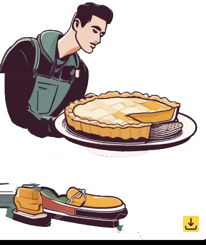
In the process of crafting a logo for a local community-based charity named People In Effect (PIE), I drew inspiration from the acronym itself. Exploring various concepts, the idea of a person serving a slice of pie stood out as a meaningful representation. To bring this concept to life, I turned to an AI image generator and experimented with different iterations. Ultimately, I chose an image featuring a chef elegantly serving a pie on a substantial plate. This logo not only captures the essence of the charity's name but also conveys a sense of generosity and community service.
Taking the image of a chef serving a pie as the foundation, I embarked on the journey of transforming it into a compelling logo for People In Effect (PIE). Initially, I removed the watermarks added by the AI generator and meticulously reconstructed the plate, erasing the original pie. With careful attention to detail and a trial-and-error approach, I recreated the plate by hand. Subsequently, I incorporated additional elements into the picture.
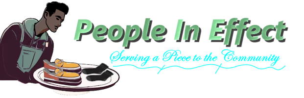
Drawing inspiration from an AI-generated image of a pair of shoes, I edited and refined the shoes to ensure they appeared appealing and serviceable. Additionally, I sourced an image of a pair of socks. Combining these elements on a separate layer, I added the shoes and socks to the plate, creating the illusion of the chef serving these items. This visual representation aligns with the group's mission of supporting the community by providing essential items such as clothing and food.
The logo cleverly plays on the PIE acronym, symbolizing "Serving a Piece to the community." The word "serving" resonates with the group's commitment to community service, while "a piece" reinforces the PIE acronym, creating a logo that encapsulates the essence of People In Effect's impactful work.

Original Image for Snapped Pencil
In the initial depiction of a hand snapping a pencil, I recognized the opportunity to enhance its resonance with the theme of anger on my website. A simple yet impactful modification involved changing the color of the pencil from blue to red, a hue that more effectively communicates the emotion of anger. This adjustment, while relatively straightforward, marked one of the early instances where I transformed an image to better align with the intended emotional context.
|

Finished Image for Snapped Pencil
In the completed rendition of the hand snapping a pencil, the simple yet impactful change of the pencil's color to red significantly enhances its portrayal of anger. This image finds its place on the hypnosis page, where it serves to address internal anger issues. Despite the straightforward nature of this transformation, I opted to retain shading on the pencil rather than opting for a solid red tone. This particular image represents the early stages of my journey toward mastery in using Paint.NET.
|

Original Image for Success
In my quest for an image that embodies success and achievement, I stumbled upon a compelling black-and-white picture. However, recognizing its potential impact, I felt it lacked vibrancy and excitement.
|

Finished Image for Success
In the finalized rendition of this image, I breathed life into the original monochromatic scene. The once bland black-and-white depiction has been transformed, with one figure now sporting a vibrant blue hue and the other radiating an energetic orange. The lightning streak above them crackles in a lively yellow, adding a burst of color to enhance the overall vibrancy of the image.
|

Original Image for Rewire the Subconcious
In the original image, the depiction of rewiring the subconscious mind featured an awkward green color for the brain. Not satisfied with the visual harmony, I decided to make a change in the final image.
|

Finished Image for Rewire the Subconcious
In the final image, I revamped the awkward green hue of the brain to a more traditional pink shade, enhancing its visual appeal. Additionally, I introduced a lighter pink tone to the interior of the brain, creating a more aesthetically pleasing representation. The transformed image now effectively conveys the intricate process of rewiring the subconscious mind, particularly within the context of hypnosis.
|

Original Image for High Road / Low Road
In the initial rendition of the high road and low road concept, I found certain elements detracting from the intended message. The presence of the figure next to the pole seemed distracting, prompting me to remove him for a cleaner composition. Additionally, the original color scheme, where the high road was depicted in red and the low road in black, didn't align with the emotional nuances I wished to convey. These aspects led to transformative changes in the final version.
|

Finished Image for High Road / Low Road
In the completed rendition of the image, I further emphasized the emotional nuances of the high road and low road concept by adjusting the shading on the signs. The High Road, symbolizing the journey to success, is now adorned with a calming green shade, transitioning from the original red. Conversely, the Low Road, representing the path to failure and frustration, now features an intense red shading, a departure from its initial black depiction. These changes contribute to a more impactful visual narrative. As an update, I am no longer using this image and I am not very satisfied with. I have created an new image to replace this one.
|

Original Image for Victory
In the original image for victory, my initial intention was to create a transparent background. However, during the process, I found myself compelled to modify the colors of the original image. The goal was to enhance visibility and infuse the image with a vibrant energy that aligns with the themes of the web pages where I intended to feature this victorious depiction.
|

Finished Image for Victory
In the finished version of this image, my quest for a representation of victory led to several enhancements. The color transformation of the shirt, from a muted blue to a vibrant yellow, was a deliberate choice to convey a sense of excitement and triumph. Additionally, I opted for a background makeover, shifting from subdued tones to a more vibrant palette, amplifying the overall energy and celebratory mood of the image.
|

Original Image for Journey
In my quest for an image to symbolize a journey, I stumbled upon this drawing featuring a forest setting intersected by a highway road. While it captured elements of what I was seeking, I envisioned a forest scene with a hiking path instead of a road for cars. Hence, I employed this image as a foundation, transforming it to better depict the essence of a journey on foot.
|

Finished Image for Journey
In the final rendition, I eliminated the highway road from the original picture and replaced it with a brown color to simulate a dirt trail. To enhance the natural feel, I added texture to the trail by introducing a layer and employing the cloud generation tool. After achieving the desired trail texture, I incorporated rocks into the scene. Utilizing a rocky texture sourced from the internet, I introduced a new layer and applied it to create a textured appearance for the rocks, resulting in the completed image.
|

Original Image for Hypnotist
In the initial artwork discovery for a hypnotist, my focus shifted to refining a pocket watch element after removing the background. The process, involving meticulous restoration using the paintbrush tool, ultimately yielded satisfying results.
|

Finished Image for Hypnosis Session
Presenting the final image of the hypnotist, featuring a pocket watch that underwent restoration. While there might be slight distortions and imperfections around the pocket watch, considering this as one of my initial attempts, the result stands as a commendable achievement.Upon futher reivew I wasn't as satisfied with this image as I once was, as such this image has been depricated and replaced witmy origional drawing of a male hypnotist.
|

Original Image for Uphill Battle
In the initial image portraying a man in a business suit pushing a boulder uphill, the concept of an uphill battle was almost ideal. However, the representation of a businessman in a suit didn't entirely resonate with the universal theme of the struggle. To align more with the idea of an everyman facing this challenge, I utilized this as a foundation for the final product.
|

Finished Image for Uphill Battle
In the final image, the businessman undergoes a wardrobe change, showcasing a more relatable weekend warrior look in casual hiking attire. The business suit is replaced with blue jeans and a green polo shirt, complemented by a brown belt. I transformed the long-sleeved shirt into a short-sleeved one, adding flesh tone to the arms and enhancing their muscular appearance. The suit's tail was removed, and the shirt and pants were smoothed for a seamless transition. I also widened the shoes, transforming them into hiking boots. These changes aim to present a more average and relatable individual facing the uphill battle.
|

Original Image for Hypnosis Session
The initial artwork for the hypnosis session captured my attention, but I found the depiction of the hypnotist as a doctor inaccurate. This stemmed from the realization that most doctors aren't hypnotists and lack any training in hypnosis. Hypnosis constitutes its own distinct field, demanding specialized training and a unique skill set that significantly differs from that of doctors. In refining this artwork, a pivotal change was made by discarding the hypnotist's lab coat and offering a significant wardrobe transformation. This alteration aimed to align the depiction with the accurate and nuanced representation of hypnotists, distinct from the conventional imagery associated with doctors.
|

Finished Image for Hypnosis Session
In the final rendition, I opted to eliminate the hypnotist's lab coat, substituting it with a crisp dress shirt and tailored pants. Not only did this adjustment contribute to a more accurate representation of a hypnotist's attire, but I also undertook a color enhancement process. The original image exhibited faded colors, prompting me to revitalize them. The background underwent a transformation from a light blue hue to a more vibrant purple, ensuring the image stands out. Additionally, I refined the details in the background images, enhancing their clarity and overall visual impact.
|

Original Image for Hypnosis Office
In the original image portraying the hypnosis office, I embarked on one of my most ambitious undertakings. While appreciating the artistic rendition of the hypnosis office, a significant challenge emerged – the depicted hypnotist was female. Given that the website revolves around me, a male, I aimed to convey a more accurate representation. In this ambitious endeavor, I delved into a transformative process, opting to perform a symbolic "sex change" operation on the image. The goal was to seamlessly replace the female hypnotist with a male counterpart, ensuring alignment with the focus and identity of the website.
|

Finished Image for Hypnosis Office
In the final image, I successfully transformed the original depiction of a female hypnotist into a male hypnotist. The male figure is clad in a dress shirt and brown dress pants. While the proportions of the legs may appear taller in relation to the body, overall, I was satisfied with the outcome. Achieving this transformation required extensive work, involving meticulous erasing and redrawing of the chair's background to accommodate the changes. The process entailed completely removing the female hypnotist, reconstructing the background, introducing the male hypnotist on a separate layer, and finally, merging the layers to produce the finished image.
|

Original Image for Brain Pain Siginals
In this transformation, the original picture features a brain surrounded by various images. With meticulous effort, patience, and the paintbrush tool, I transformed the initial image into the detailed drawing of the brain showcased in the final result. The process involved dedicated time and attention to achieve the desired outcome, and I am genuinely pleased with the impressive transformation.
|

Finished Image for Brain Pain Signals
Building upon the transformation from the original image to the detailed drawing of the brain, I further enhanced the depiction by adding lightning bolts. These bolts symbolize the disruption of brain signals associated with chronic pain. The lightning bolts were meticulously created by hand, employing the paintbrush tool with a vibrant blue color and adjusting brush widths to achieve a striking and symbolic effect. This image serves as an illustration of the transformative process from one image form to a completely different representation.
|

Original Image for Dissociate From Pain
In the initial image, a man is depicted in a pushing motion, providing a suitable foundation for the creation of an illustration for my chronic pain article. The focus was on illustrating dissociation as a technique to alleviate chronic pain.
|

Finished Image for Dissociate From Pain
After flipping the image and adjusting the orientation of the guy, I incorporated various layers into the composition. I duplicated the guy and transformed him into red, symbolizing the experience of pain. Employing the blur tool on each layer, I created varying blur effects to simulate the impression that he was pushing the red version, representing the pain outside of his body. Following the desired blur effects, I added lightning bolts above the red version to enhance the depiction of pain. To complete the image, I introduced a final layer using the cloud generation tool for the background effect. Utilizing the hue transformation, I added a colored background to evoke a dissociative atmosphere.
|

Original Image for Magic Pen
In the original image, a blue fountain pen with a cap served as the foundation for illustrating the magic of handwriting analysis. My ultimate goal was to convey the idea of a pen as a magic wand, symbolizing the transformative power of skilled handwriting analysis. This image provided a solid starting point for that vision.
|

Finished Image for Magic Pen
To achieve the desired result, I began by editing out the cap of the pen and rotating the image to a preferred angle. Next, I added an extra layer to incorporate a magical effect at the end of the pen, resulting in a fountain pen magic wand that illustrates the enchanting and enjoyable nature of handwriting analysis.
|

First Attempt at Drawing a Human
In my initial venture into drawing human figures, I acknowledge the mixed results, but I believe it holds potential, especially within a specific context. Although I haven't identified the perfect spot for its inclusion on the website, I remain open to integrating it should a fitting context arise.
|

Freehand Willy
Meet Freehand Willy, my second attempt at capturing the human form. Executed entirely freehand, this drawing originated as a basic sketch outlining the head, body, and legs. Subsequently, I meticulously added color and refined the rough shapes, gradually shaping the image. Although I acknowledge there's room for improvement, I am optimistic about finding an appropriate place for Willy on my website in the future.
|

Cathy Green
Meet Cathy – my initial foray into freehand drawing of a woman. While I grapple with the intricacies of forming the human figure, Cathy represents my earnest efforts in capturing feminine grace. In this ongoing artistic journey, I'm confronted with challenges, especially in refining body and leg structures. Despite these hurdles, Cathy stands as a testament to progress, showcasing my evolving skills. As I continue to overcome artistic obstacles, Cathy eagerly awaits her destined place on the website, adding a touch of elegance to my creative narrative. Stay tuned for where Cathy's unique charm will find its perfect spot in my evolving artistic tapestry.
|

Jill
Meet Jill, the latest addition to my artistic journey. 🎨✨ With each stroke, I'm exploring the world of portraiture, honing my skills in people illustration. In this rendition, I've embraced the power of layers in Paint.NET, allowing me to meticulously craft different elements and refine details without disrupting the entire canvas.
As my artistic exploration unfolds, I discover new features in Paint.NET every day, empowering me to push the boundaries of my creativity. Join me on this evolving journey as I navigate the nuances of digital art, one layer at a time
|

Recliner
Dive into the artistry of the hypnotic with my latest creation — a meticulously crafted recliner brought to life stroke by stroke in Paint.NET. This bespoke piece, strategically positioned in the classic reclining pose, serves as a visual metaphor for the comfort and ease one might experience during a hypnotic state.
Each detail of the recliner is a testament to the intricate process involved in its creation. From the plush upper back to the carefully layered padding, I intricately drew each element, treating every layer as a canvas of its own. The journey unfolded as I sculpted the upper chair, delicately flattened the image, and embarked on the nuanced task of constructing the seat.
The arms of the chair, standing tall in their individual layers, tell a story of patience and dedication. A separate layer for the footrest completes the composition, harmonizing with the overall design.
This artistic endeavor was a voyage of trial and error, a process of discovery where every attempt led to a new lesson in the art of creation. The hypnotic recliner, born from a desire to capture the essence of hypnosis, is not just a piece of furniture; it's an exploration, an expression, and an invitation to dwell in the serene realm where art and hypnosis intertwine.
|

Cathy Green in a Hypnosis Session
Journey into the realm of tranquility with my latest creation, an artistic fusion capturing the essence of a hypnotic session. Building upon the foundation of the meticulously crafted recliner, I seamlessly integrated the serene presence of Cathy Green, a figure synonymous with relaxation and introspection.
In a delicate dance of layers, Cathy's head and body found their place on the recliner canvas, bringing the scene to life. A new layer unfolded with the addition of a comforting blanket, drawn with meticulous attention to detail. Cathy, her eyes gently closed, exudes a sense of peaceful surrender, inviting viewers to join her in the serenity of a hypnosis session.
The blanket, textured to perfection with inspiration drawn from the rich tapestry of the internet, gracefully envelops Cathy, adding a tactile dimension to the visual narrative. As the final strokes were applied, the carpet, initially a grey blob, transformed into a textured surface, grounding the hypnotic scene in a comforting and familiar reality.
This composition is more than an artwork; it's an invitation to experience the symbiosis of art and hypnosis, where the lines between the imagined and the real blur, and serenity becomes a tangible presence.
|

Laura - Drawing a Person from the Side
In my continuous journey of capturing the essence of individuals through art, I proudly present "Luara." This piece marks my initial venture into the captivating challenge of portraying a person from a side perspective. As I navigate the intricacies of facial profiles and expressions, the evolving results hold a special place in my artistic growth.
While the journey is ongoing, I find joy in every stroke and discovery. Using tools like paint.net, I am honing my skills, learning, and refining my ability to bring characters to life on the canvas. Join me in this exploration of perspectives and witness the evolving tapestry of my artistic expression.
|

Cathy Green - Hypnotist
In this artistic endeavor, I embrace the challenge of capturing a single persona through diverse lenses, portraying Cathy Green from varying perspectives. The task of rendering the same individual in different drawings has proven to be a rewarding challenge. In this particular piece, Cathy Green assumes the intriguing role of a hypnotist, weaving an enchanting narrative through the strokes of my mouse. Join me as I embrace the challenge of creating the same person twice, from a different prespective.
|

Male Hypnotist
This creation is of a male hypnotist. I've endeavored to craft a new representation of a male hypnotist, replacing a previous image sourced from the web that didn't quite meet my satisfaction. Drawing upon techniques refined through experience, I've created this new depiction to replace instances where the outdated image was used on my site. This piece reflects my evolving skills and a commitment to presenting a more personally crafted and resonant visual narrative.
|

High Road / Low Road Sign
In this image, I've designed a new high road/low road sign, symbolizing the choice between an easier but less fulfilling path and a challenging route leading to goals. This replaces a previously sourced image that fell short of my satisfaction. The creation process involved crafting sign objects and applying various texture images to enhance their visual appeal.
|

High Road / Low Road Sign
In this image, I intentionally depicted Jill under stress to convey the theme of stress. I've replaced the previous image of Jill with this updated version in areas on the website where stress-related visuals are necessary. Utilizing layers in image editing facilitates modifications without the need to erase entire sections. By toggling layers on or off, adjustments can be made more efficiently, streamlining the process of implementing changes.
|
Explore my Technology Resources
Contact Adam Fistler BCH - Behavioral Change Consultant
Examine a Brief Overview of Technology Background
Explore some Select Project's I'm Working On
Explore my Technology Articles
Outsorucing Your Agency: The Platform Wants to Be Your Higher Power
When the Machine Becomes the Scapegoat: Applying the Family Systems Model to Corporate America